All Activity
- Yesterday
-
 Letter Library posted a design in Typefaces
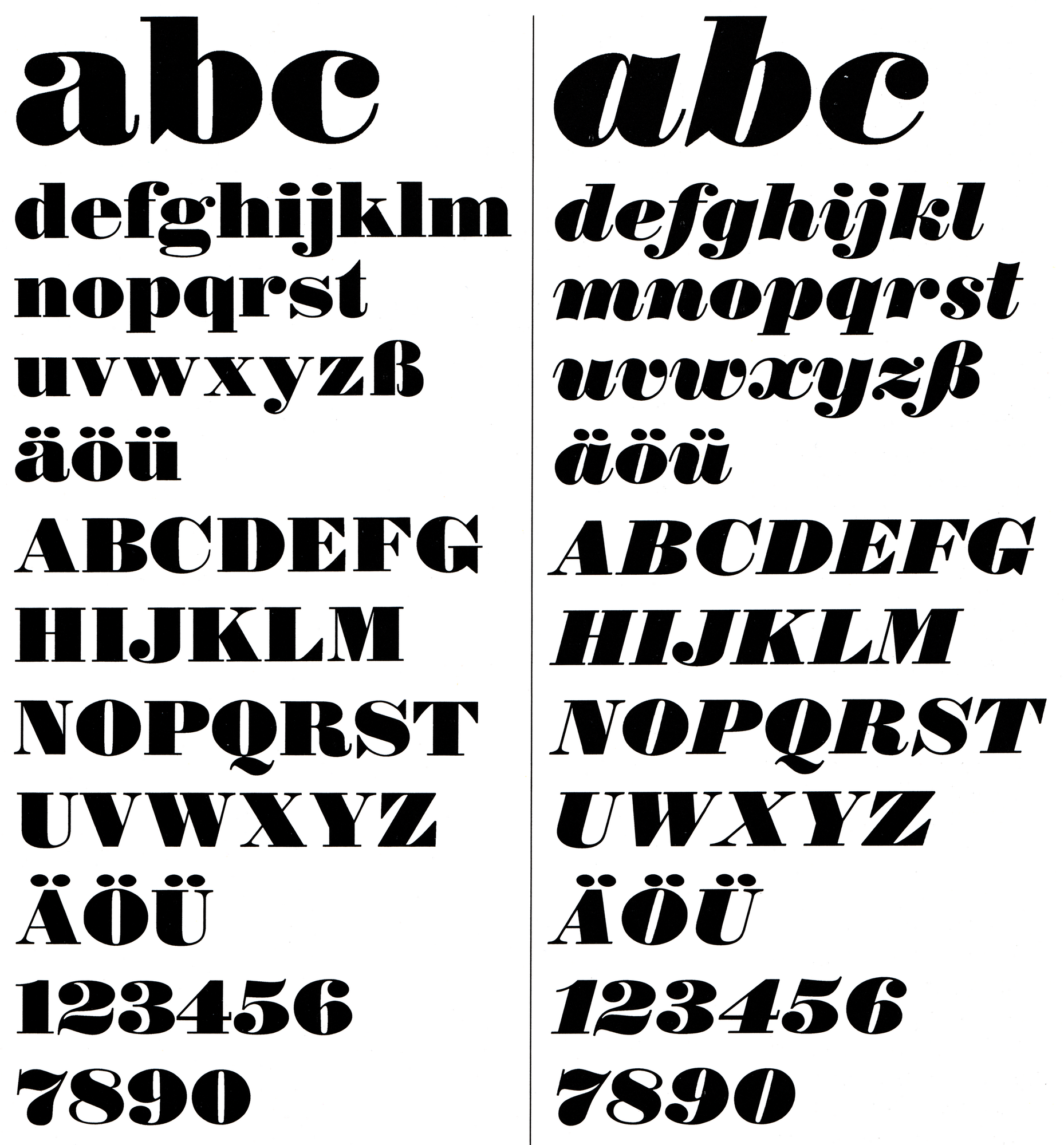 Fette Antiqua [Typoart] is a typeface designed by Barbara Cain, published by VEB Typoart
 -
- Last week
-
 Andreu joined the community
 -
Letter Library posted a design in Typefaces
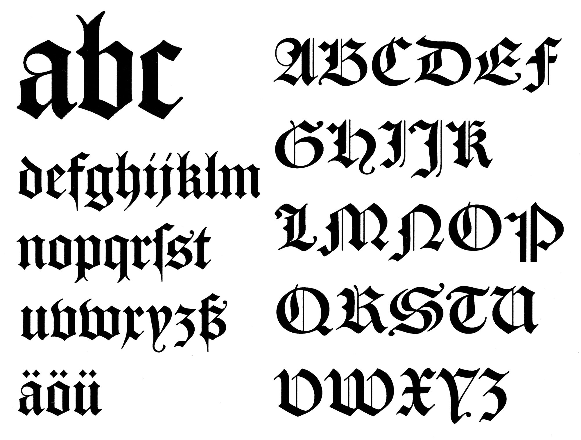 Caslon-Gotisch [Typoart] is a typeface designed by Erhard Kaiser, William Caslon I, published by VEB Typoart
 -
 lush757 joined the community
 - Earlier
-
Letter Library posted a design in Typefaces
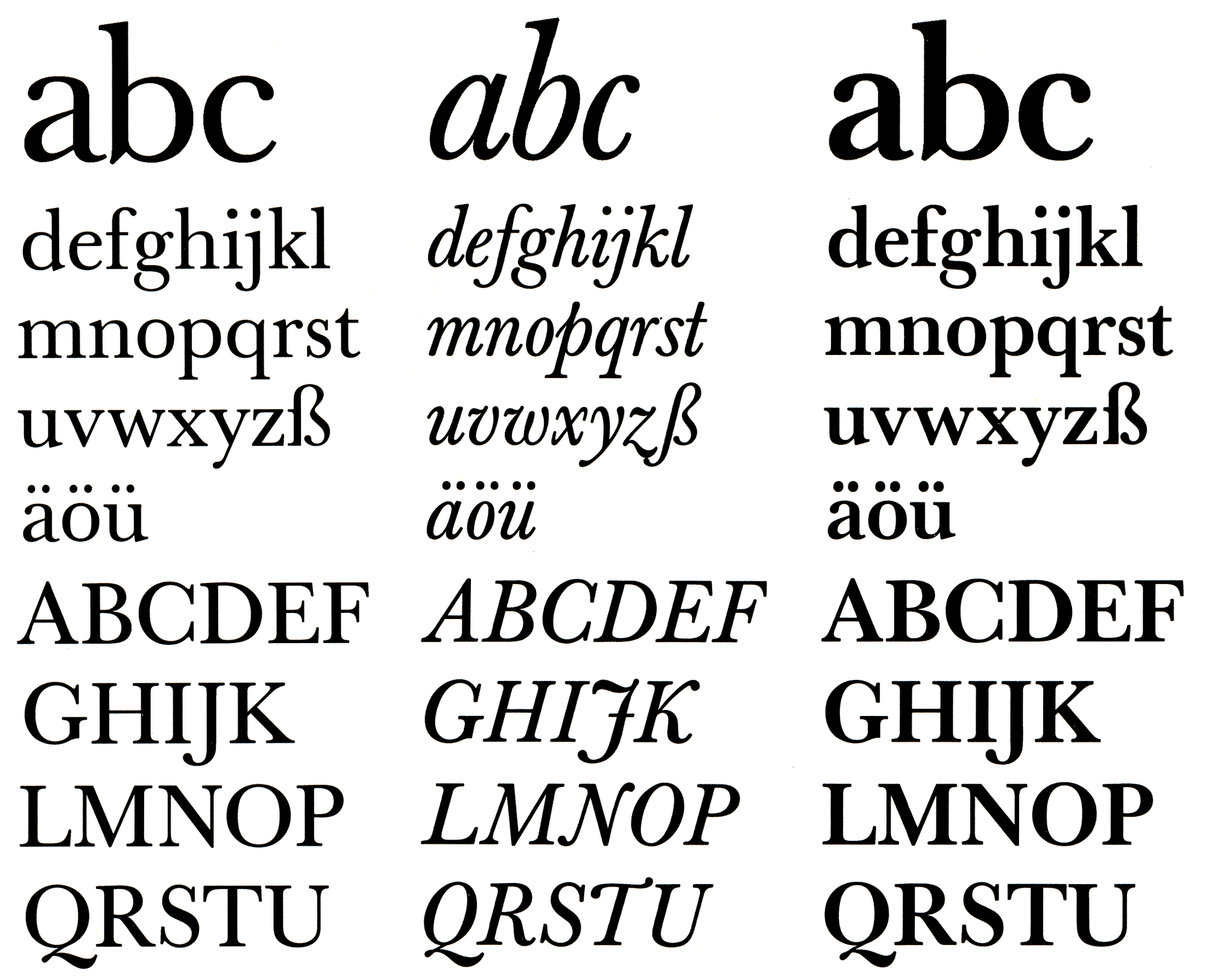 Typoart-Baskerville is a typeface designed by Hans-Peter Greinke, Volker Küster, published by VEB Typoart
 -
 Kimi Kanerva joined the community
 -
-
-
Letter Library posted a design in TypefacesConstrictor is a typeface designed by Fred Shallcrass, published by Frere-Jones
-
 ggodby01 joined the community
 -
 Nele Reineke joined the community
 -
Letter Library posted a design in Typefaces
 Typoart Egyptienne is a typeface designed by Hans-Peter Greinke, published by VEB Typoart
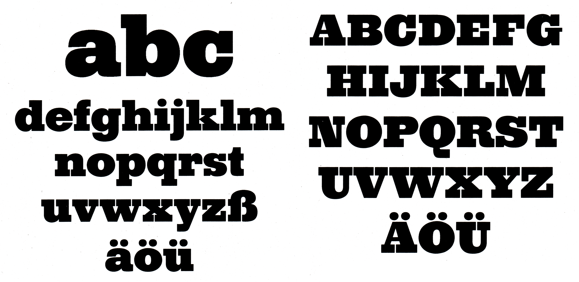
 -
 werksatz joined the community
 -
 Martin joined the community
 -
Letter Library posted a collector’s object in Collector’s Objects

-
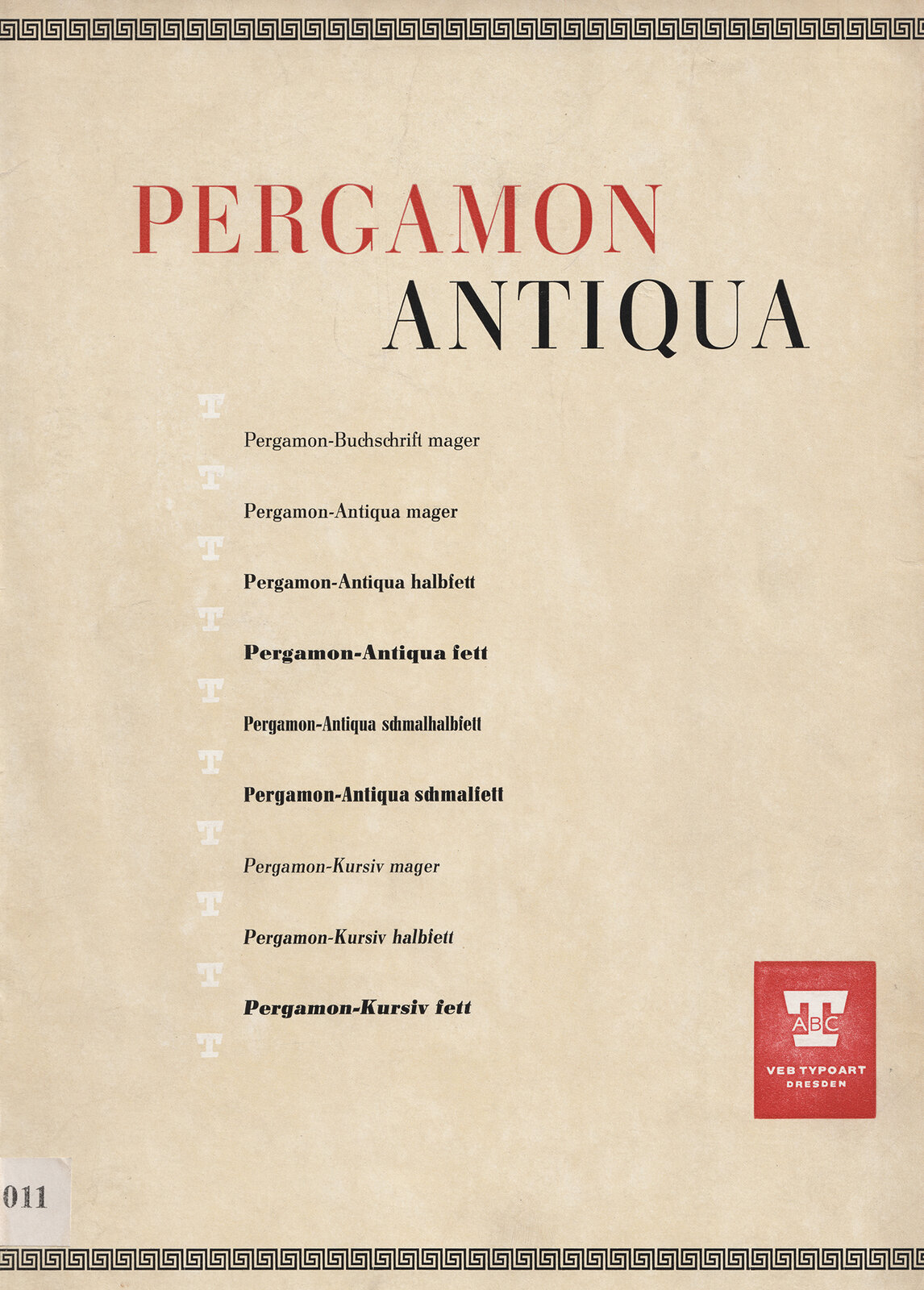
Letter Library posted a publication in Type Specimens
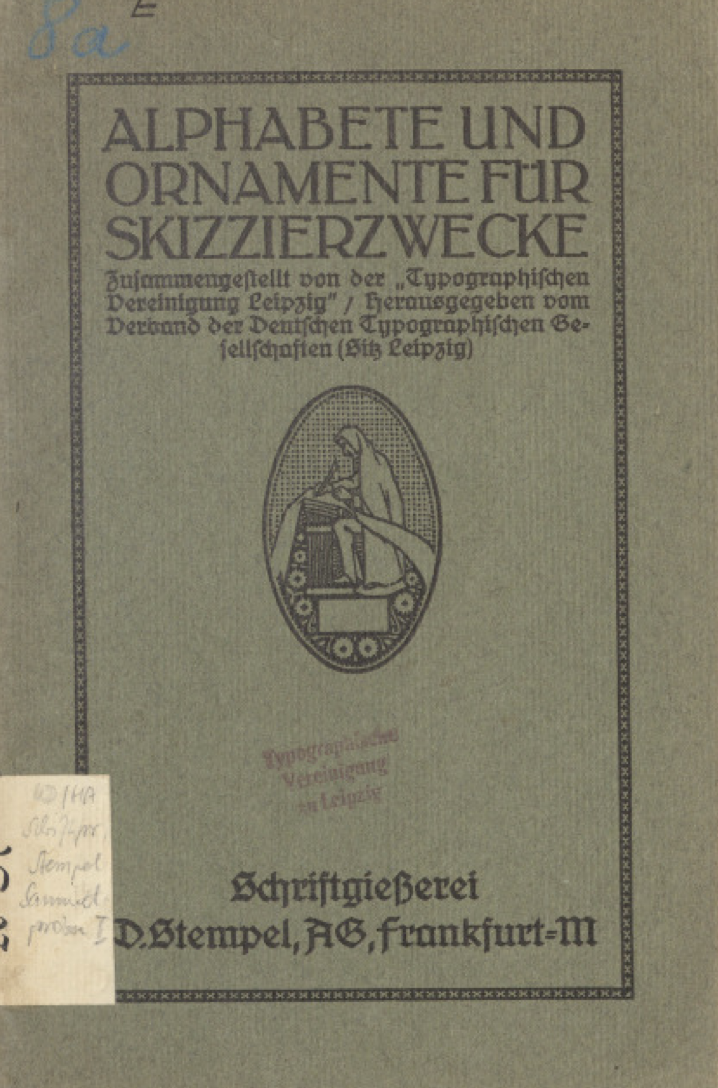
-
 rlj joined the community
 -
Letter Library posted a collector’s object in Collector’s Objects
 Missing pages 7, 9, 14, 18, 19
 -
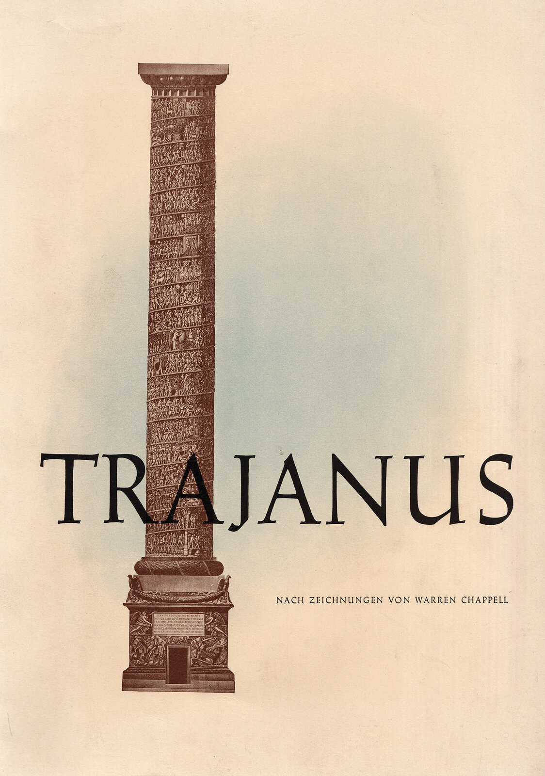
Letter Library posted a publication in Type Specimens
 Folder with loose type specimen sheets. Based on the included typefaces, likely published between 1954 and 56, when the foundry stopped producing type.
 -
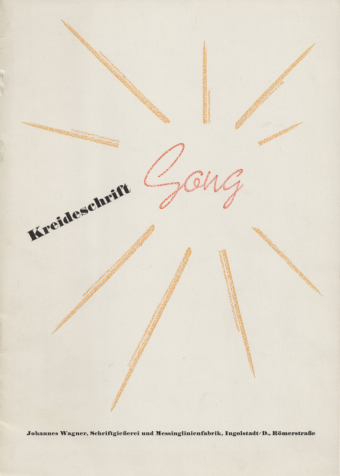
Letter Library posted a file in Type Specimen Downloads
 Folder with 21 loose sheets
 -
 bruno joined the community
 -
 benbunch joined the community
 -
Letter Library posted a collector’s object in Collector’s Objects
-
Letter Library posted a publication in Type Specimens

-
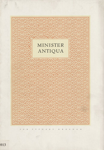
Letter Library posted a collector’s object in Collector’s Objects
-
-
-
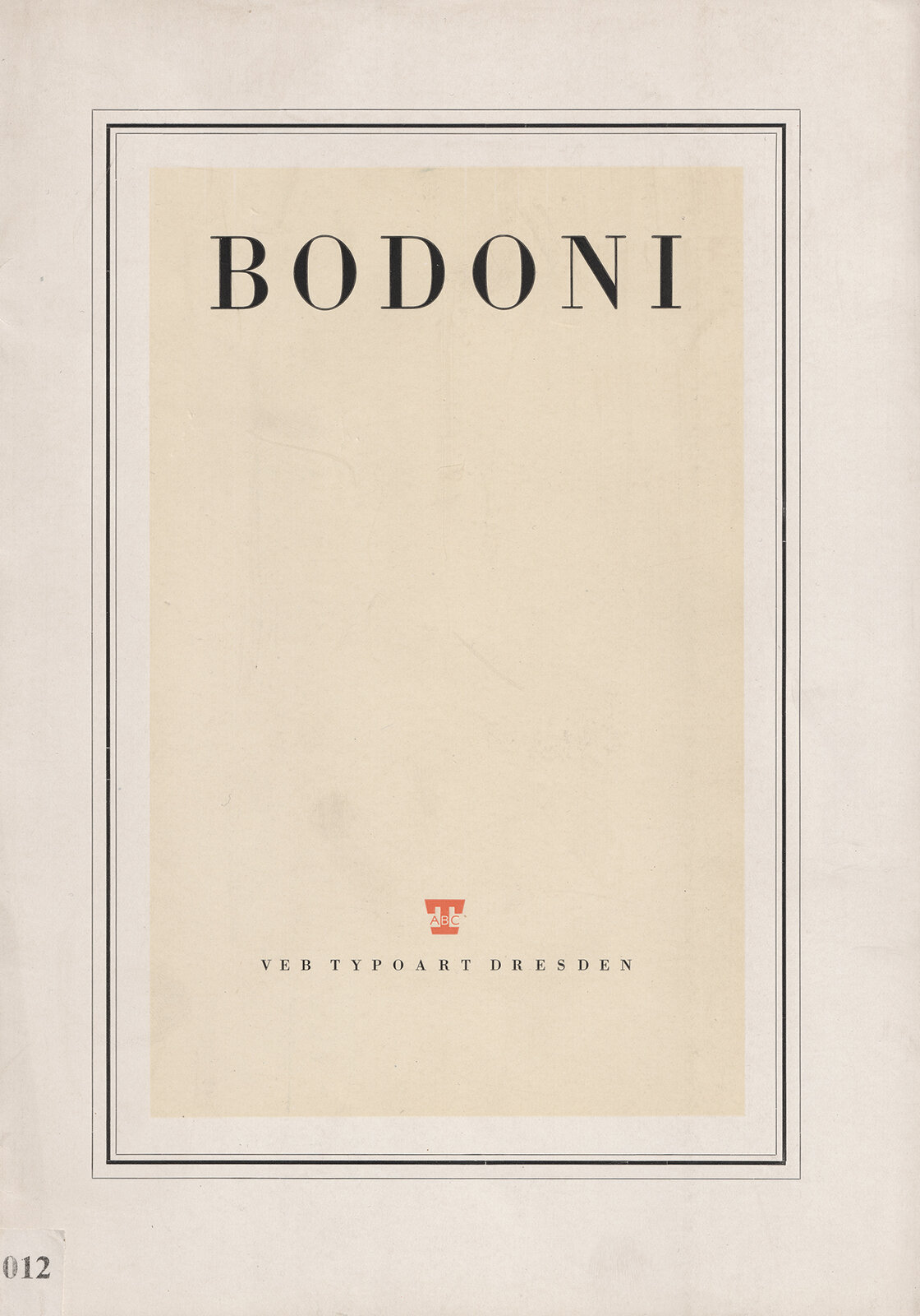
Letter Library posted a collector’s object in Collector’s Objects
-
Letter Library posted a publication in Type Specimens
 brochure with 16 pages.
 -
Letter Library posted a collector’s object in Collector’s Objects
-
Letter Library posted a publication in Type Specimens

-
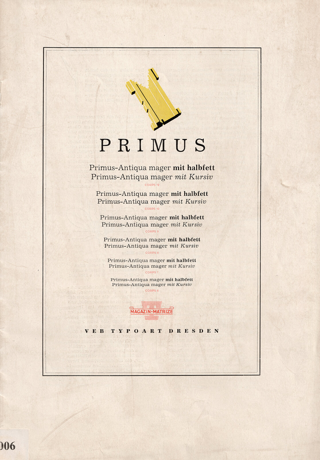
Letter Library posted a file in Type Specimen Downloads
 Folder with 5 pages, one for each style.
 -
Letter Library posted a collector’s object in Collector’s Objects
-
Letter Library posted a collector’s object in Collector’s Objects