


Introduction
Didone is a genre of serif typeface that emerged in the late 18th century and was the standard type style for general-purpose typesetting during the 19th century. The name of the category is a combination of the surnames of the famous type founders Firmin Didot and Giambattista Bodoni, whose efforts defined the style around the beginning of the nineteenth century.

Today, Walbaum-Antiqua is one of the most famous German typefaces in the Didone style. But its widespread acclaim did not materialize until the 20th century. Following their creation around 1800, Walbaum-Antiqua fonts experienced limited utilization. This can be attributed to the prevailing adherence to traditional practices in German typesetting during the 18th and 19th centuries, which commonly featured the use of blackletter fonts for German texts.

Example of a typical German book from the 18th century
The modernization of type styles and the page layout during the 18th century happened outside of areas that later became Germany. While some German publishers and authors were aware of these changes and intrigued by what they understood as “French typography”, the transition away from blackletter fonts was not a straightforward endeavor. The general public in Germany couldn’t read roman typefaces as well as blackletter and they deeply associated blackletter with their national culture. Printing German books in a “foreign” typeface was therefore seen as an act of cultural disloyalty.
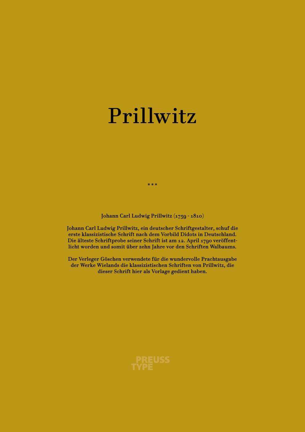
And the roman fonts weren’t easily available in Germany at that time. One of the first German type founders to offer roman typefaces in the style of Didot was Carl Ludwig Prillwitz in Jena. Shown below is a reprinted type specimen he published in 1790.

In the late 1790s and the early 1800s century, a discourse emerged within professional circles, including academics, publishers, and authors, regarding the retention of blackletter fonts versus adopting roman fonts. A few publishers dared to publish their German books in roman fonts during that time, often using the roman fonts from Prillwitz.

Prillwitz letters in a book printed by Göschen in Leipzig

Record maintained by Letter Library